

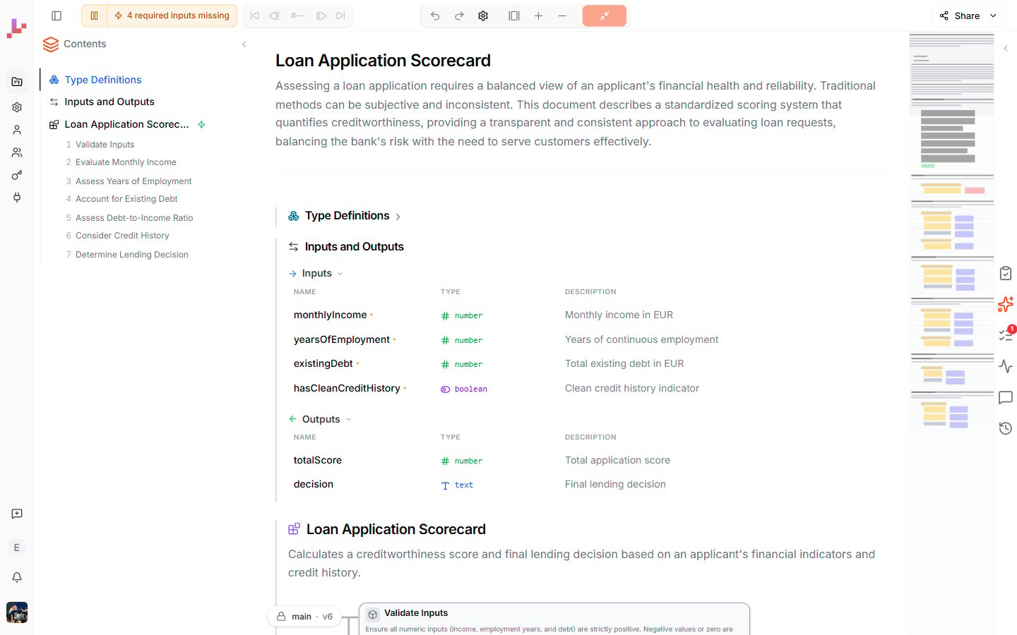
Editor layout
The editor is divided into four areas: a top toolbar, a Contents sidebar on the left, the document area in the center, and a tabbed sidebar on the right.Top toolbar

- Toggle sidebar — collapses or expands the main app sidebar (the narrow vertical strip with Projects, Profile, and API keys).
- Live execution — a play / pause button (with a status pill beside it) that controls Live mode. While it is running, your Blueprints re-execute automatically every time you change inputs or logic, so the Outputs footer in each section stays current. Pause it to stop auto-running; resume it to turn continuous execution back on.
- Maximized blueprint pill — when a Blueprint is maximized to its diagram, its name appears here. Click to switch which Blueprint is maximized; click the X to leave the maximized view.
- Trace controls — Jump to first / Previous / Step counter / Next / Jump to last, plus Step into and Step out for Call nodes, and Exit trace. These are active after you run a Blueprint and let you replay the execution step by step. See Test your Blueprint.
- Edit and view controls — undo and redo, zoom, fit-to-view, and canvas display settings, for the maximized diagram.
- Share — opens the Share menu with deployment options (Connect, n8n, Code, Embed, PNG, Export Source) and a Link for public read-only links.
Contents sidebar (left)
The Contents sidebar shows everything in your project as a navigable table of contents:- Type Definitions — reusable Value Types and Data Types defined at the project level. Double-click to open the Type Definitions editor.
- Inputs and Outputs — a shortcut to the project’s external interface, which is the signature of the active Execution Scope. See Inputs and Outputs.
- Blueprints — every Blueprint in the project, listed with its name. Each Blueprint shows its numbered sections (1, 1.1, 2, …) when expanded. Double-click a Blueprint or section to maximize it.
- Dependencies — at the bottom, a graph showing which Blueprints call which. Useful for navigating large projects and spotting circular dependencies.
Execution scope and the main Blueprint
A green spark icon (⚡) next to a Blueprint name marks it as the active Execution Scope — the entry point that runs when the project is invoked from outside. Its signature is the project’s external interface (and what the Inputs and Outputs shortcut at the top of the sidebar points to). You can change which Blueprint is the active Execution Scope; the others remain in the project and can still be called via Call nodes.Parameters and Quick Run
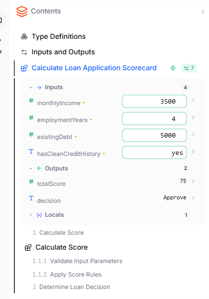
- Each input shows its name, description, and a control to set a value (e.g.
not setdropdown for an enum, a number field for a number) - Each output shows its name, description, and the most recent value (after a run)
Document area (center)
The center area shows the project as a structured document. The top of the document shows the project’s name and description, followed by Type Definitions, Inputs and Outputs, and then each Blueprint as a section with:- A heading with the Blueprint name and description
- An interactive diagram showing the Blueprint’s logic
- An Outputs footer (when Live mode is running or after a manual run) showing the current output values
Right sidebar

- Tests — manage test suites for the active Blueprint. Create them manually or auto-generate with AI.
- Agent — open the Lab Agent, a conversational AI that builds and edits Blueprints, runs your tests, and proposes changes for you to approve.
- Findings — issues the Lab Agent surfaces when it reviews your project, recorded so you can work through them.
- Prod Runs — execution logs from when your Blueprint runs in production via the REST API or MCP.
- Comments — leave comments on Blueprints, sections, or nodes for team collaboration.
- Timeline — the project’s change history: every version, who changed what, and the option to restore an earlier state. See Timeline.
Editing a maximized diagram
When a Blueprint is maximized, you edit it directly on the canvas — double-click an element to change it (see Inline editing), or add elements at the connection points between nodes. To edit with AI, select a node and press Ctrl+I to send it to the Lab Agent — see Edit with Ctrl+I. Undo, redo, zoom, and canvas settings are in the top toolbar.What to do next
- Specification view — navigate and edit the project as a document
- Diagram view — work inside a single Blueprint’s diagram
- Inputs and Outputs — define what data flows through your project
- Lab Agent — build and edit your Blueprints by chatting with AI